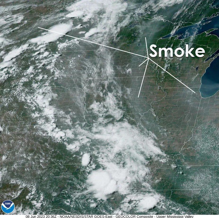
Notice the Cool Air Boundary labeled on the satellite imagery. It is identified by the narrow line of cumulus clouds that has formed along its leading edge. Compare the shape and location of the cloud line with the trof (that is short for trough line) dashed line on the map from Illinois into Indiana to a weak low center Ontario. The shape on the map does exactly not match the satellite. The satellite gives the best location for the trof line because the data on the map is not spaced close enough together to place the trof exactly. The satellite image gives forecasters a better look at the trof and what is going on along it than the surface map.
If you have practiced your station model plotting or have looked at where the data is plotted around the observation locations on the map you know that the temperature and dew point are plotted to the left of the station location. For example Chicago reports a temperature of 76 and a dew point of 55. The cooler air behind the trof has dew points in the 50s. Ahead of the trof dew points are in the 60s.
The trof line is where the leading edge of cooler drier air shows up on the satellite image as line of cumulus clouds. The satellite provides the best look at where the trof is really located. The surface map shows us the weather observations on the ground - wind, temperature, dew point, cloud cover, pressure and pressure changes. Using both sources of information gives us the best picture of the trof location and weather conditions ahead and behind it.
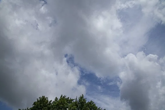
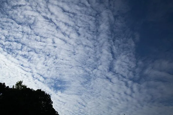
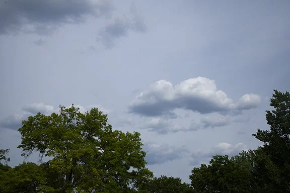
Scroll down to see the clouds over northeast Iowa.


